At BBS, we live and breathe smart design systems. Figma is our tool of choice—not just because it’s powerful, but because it’s collaborative, scalable, and lightning fast when used right.
Whether you’re designing your first MVP or scaling a product used by millions, here are 7 pro tips our team uses to get the most out of Figma.
1. Design with Auto Layout from Day One
Auto Layout1 isn’t optional—it’s foundational. It makes your designs responsive, consistent, and developer-friendly.
Pro Tip: Nest Auto Layouts like flex containers. Use it for buttons, cards, navbars—anything that adapts to content.
- Responsive designs become effortless.
- Developers will love you (and ship faster).
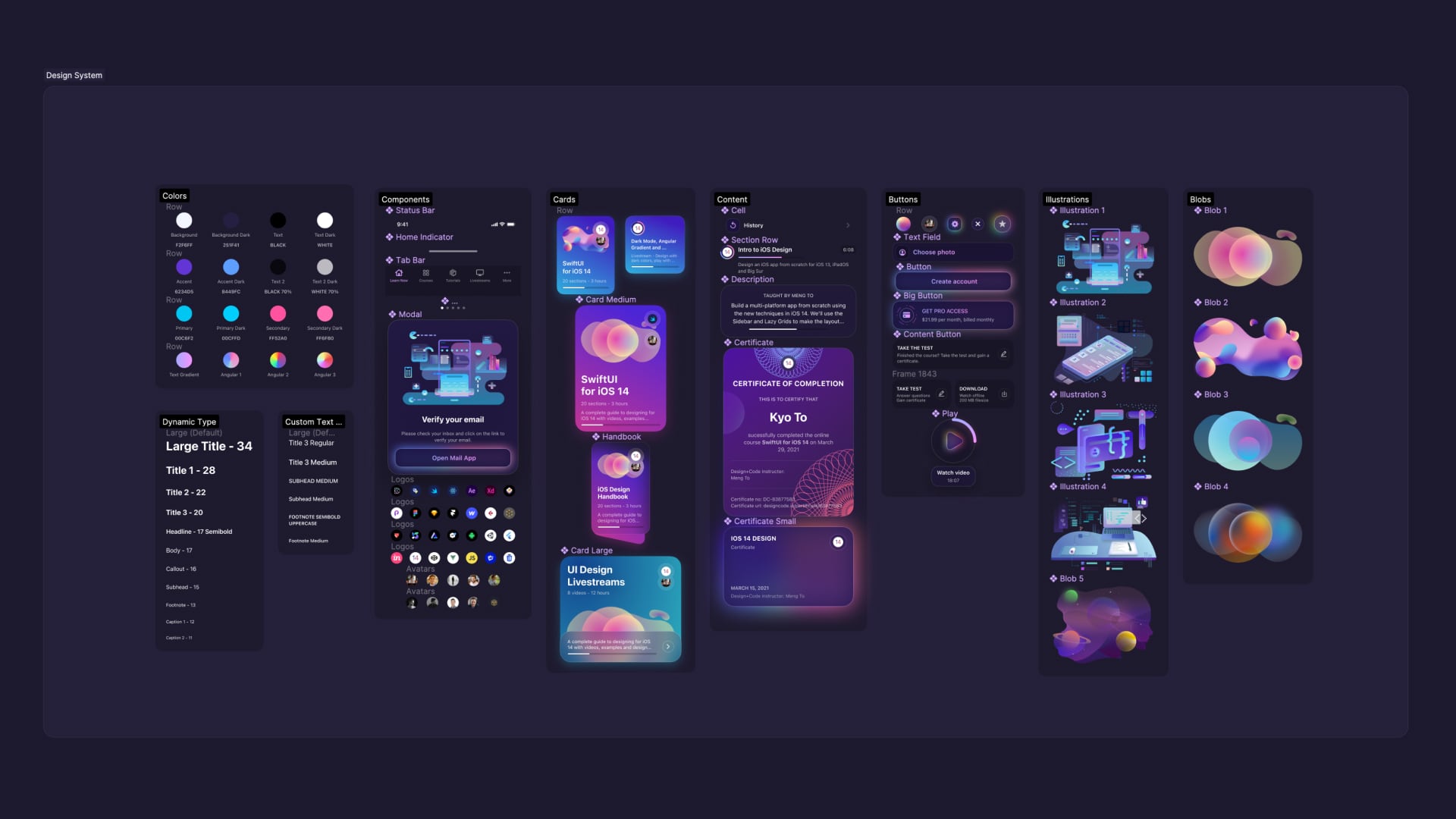
2. Systematize with Components + Variants
We build every design system with reusable components2—because repetition is the enemy of scalability.
Pro Tip: Combine Variants with smart properties (booleans, text overrides) to create ultra-flexible UI kits.
- One master button → 16+ use cases.
- Rapid updates across your product in seconds.
3. Create and Enforce Design Styles
Color palettes, typography, shadows—make them styles. It’s how we ensure visual consistency across brands and products.
Pro Tip: Always start with a style guide file3. It’s your single source of visual truth.
- Update a brand color once, and it reflects everywhere.
- Keeps the whole team aligned—from design to dev.
4. Use the Right Plugins (Not All of Them)
Plugins4 are great, but curated tools beat clutter.
Pro Tip:
- Iconify – vast icon library, clean imports
- Content Reel – for fast mockups with real-ish data
- Autoflow – quick flow diagrams
- Spelly – because typos sneak in
Buildbox Tip: We regularly audit our plugin stack for speed + relevance.
5. Prototype Like It’s the Real App
Clickable, interactive prototypes reduce dev cycles and boost stakeholder confidence.
Pro Tip: Use Smart Animate and Component States to demo interactions like hovers, toggles, or slide-ins.
- Your prototype becomes the spec.
- Clients love seeing things move.
6. Organize Your Figma Files Like a Dev Repo
Clean files = faster onboarding, easier handoffs, fewer bugs.
Pro Tip: Use naming structures like /Atoms/Button/Primary to mirror your codebase. Pages = chapters, not chaos.
- Developers get pixel-perfect specs.
- Future designers know where everything lives.
7. Collaborate with Precision
Figma’s multiplayer magic is only magical when it’s intentional.
Pro Tip: Use comments for async reviews, lock key elements, and assign owners to pages or sections.
- No more “who moved my artboard?”
- Collaboration stays focused and productive.
Top 3 Places to See Great Design in Action
Need inspiration or just want to see what’s possible? These are our go-to platforms for top-tier UI/UX:
- Mobbin
A curated library of real product designs from top apps (Airbnb, Stripe, Notion, etc.)—organized by flow, platform, and component. - Godly
Showcases beautiful, modern websites with advanced interactions. Great for branding, motion, and portfolio inspiration. - Dribbble
Still the best place to see what independent designers and studios are dreaming up. Use it for visual trends, typography, and concept work.
Design smart.
— BBS Team
- https://help.figma.com/hc/en-us/articles/5731482952599-Add-auto-layout-to-a-design ↩︎
- https://help.figma.com/hc/en-us/articles/360038662654-Guide-to-components-in-Figma ↩︎
- https://www.figma.com/community/file/1193324873849509819/free-style-guide-template ↩︎
- https://www.figma.com/community/design-tools ↩︎
Leave a Reply